Contour visualization with Plots.jl
I found that the official tutorial of contours plot on Plots.jl website is not enough for us to generate good visualization. So below is my attempt to have a nice plot.
Prerequisite
- Julia 1.7.1
- Plots.jl 1.25.7
- Backend: GR
We use Himmelblau’s function to illustrate our visualization. The function is straightforward to define in Julia:
using Plots
f(x, y) = (x^2 + y - 11)^2 + (x + y^2 -7)^2
range_x = -6:0.1:6
range_y = -6:0.1:6
The first attempt
contour(range_x, range_y, f, xlabel="x", ylabel="y")
The code snippet above means that we need to draw the contour of function f with range of its parameter x and y defined by range_x and range_y respectively. Here is the result
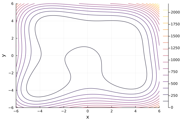
The result is quite terrible since it does not allow us to recognize local minima. Can we do better?
The second attempt
The answer is yes since contour provides several parameters and we try to explore in order to make better plot.
The most important parameter we will explore is levels
contour(range_x, range_y, f, xlabel="x", ylabel="y", levels=200)
Basically, it will plot 200 contour lines in this visualization and here is the output
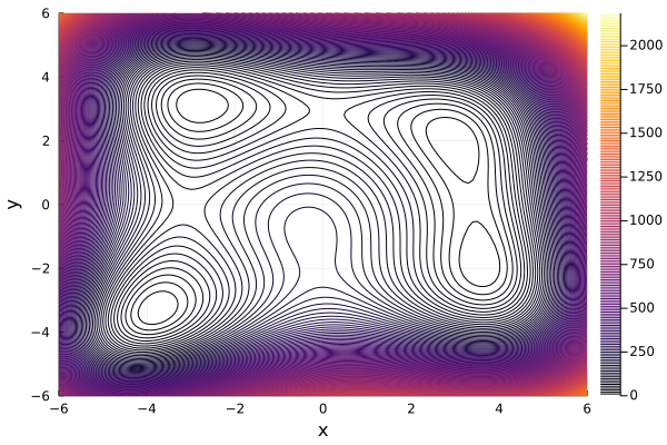
The figure above is a little bit better than the one of the first attempt. From the figure, we can somehow recognize that there are 4 local minima. However, since the number of contour lines is too large, the gap between 2 consecutive contour lines near the edge of figure is so small. Sequentially, it makes some illusion that there are more than 4 local minima. Hmm, it is not clear enough for us.
The third attempt
In this attempt, we try to make the number of contour lines small enough for clear visualization but at the same time, the lines must be representative enough. How can we achieve these two goals at the same time? We observe that Himmelblau’s function is always positive since it is the sum of two squares. Hence, we want to have contour lines when function has values 0. We also choose some other values to put contour lines. Now, we have a list of values of function that we want to draw contour lines and the list can be set by levels parameter.
contour(range_x, range_y, f, xlabel="x", ylabel="y",levels=[0,1,2,5,7,15,30,60, 120, 250, 500])
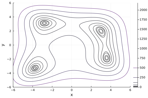
Now, the figure is awesome, we now can see clearly the 4 local minima.
The final attempt
Black and white figure is boring. We want to have some color to make it more exciting.
contour(range_x, range_y, f, xlabel="x", ylabel="y",levels=[0,1,2,5,7,15,30,60, 120, 250, 500], fill=true)
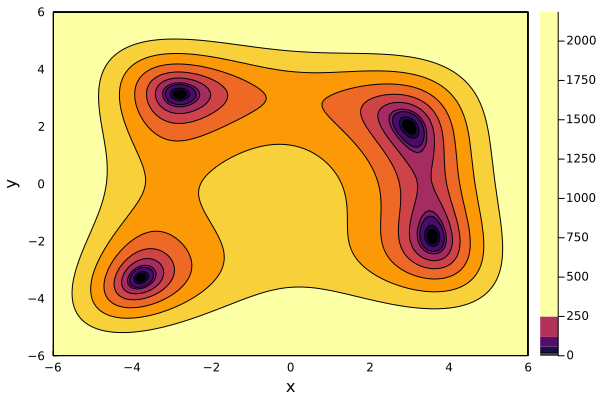
Finally, the contour plot is 90% on par with the one on Wikipedia page.
Closing thoughts
For me, to have good contour plot, there are two points we need to consider
- First, we need to find the good value range of variable. Specifically, within this range, the function should have local maxima and minima.
- Second, we should somehow predict the min/max value of function so that we can put these values for parameter
levels